- Posts
- 4,439
- Likes
- 11,284
kyle L
· ·GrasshopperBut for some reason this one really does it for me! 133.8 Chronometre:


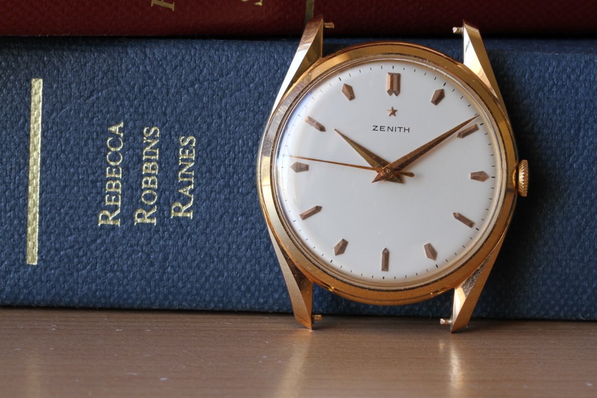
Zenith is definitely way out of my wheelhouse but:
1. Does the "Zenith" font not look too spread out and a bit off?
2. The "Swiss Made" I have seen on other similar examples is noticeably wider.
3. Was this order of the text more frequently seen on slightly later examples?
4. The dial is immaculate and very white (too white?).
I hate to be the noob who cried redial but I am very curious.
I also thought the font looked a bit off somehow - but it was hard to articulate. And the harsh white dial, too. Not really experienced enough with these Zenith's, though.
Still - this one ticks it off for me!
I think its original. Its more inline with the last picture you posted. Yet on these watches there are tons of variations.
Do you happen to know the caliber and movement number of this example?

I also thought the font looked a bit off somehow - but it was hard to articulate. And the harsh white dial, too. Not really experienced enough with these Zenith's, though.
Still - this one ticks it off for me!


")
