I'm not usually a Zenith guy...

Posts
4,439
Likes
11,284
Thanks guys. The reason it may seem too white is the way the pictures came out. I also have not seen this font variation before but looking under a loupe, it seems very well done as does the minute track. The rest of the condition of the watch leads me to believe that it hasn't been messed with a lot. I can try to take a macro shot of the fonts soon. :-)
 
Posts
1,630
Likes
14,525
In your 71 the spacing of the letters in "automatic" is wider, the letters of "Zenith" are horizontally elongated (note the E), the letters of "Chronometre" are closer together, and the "Swiss made" is approximately 4 minutes long versus 2.

I acknowledge that there are variations I just have not come across one like it yet.

Good spotting, my intention though was to show the variability in dial font between my 2 examples, which I think shouldn't be redials :p
 
Posts
4,048
Likes
9,185
Hi Kyle


Love the watch.

I have a 133.8 in gold like the logo of the gold cal 71. , but in a 35 mm case vs a cal 71 in a 36 mm case.

It's a great watch!

Good hunting

Bill Sohne
 
Posts
2,732
Likes
4,765
Thanks guys. The reason it may seem too white is the way the pictures came out. I also have not seen this font variation before but looking under a loupe, it seems very well done as does the minute track. The rest of the condition of the watch leads me to believe that it hasn't been messed with a lot. I can try to take a macro shot of the fonts soon. :)
I must agree that the quality of the printing is excellent. Macros would be neat though I am more interested in the spacing and font rather than the execution.
Good spotting, my intention though was to show the variability in dial font between my 2 examples, which I think shouldn't be redials :p
There is certainly variability though I have tried to provide and compare watches with close serial numbers and the same caliber.
Your examples not only look original but breathtaking. That 135 is a true grail piece. ::love::
 
Posts
4,439
Likes
11,284
Hi

Here is a not so good photo of my 133.8 chronmetre


The Seamaster isn't too shabby either. ;)
 
Posts
1,770
Likes
7,705
Love the case on that Zenith.

Zenith usage of fonts isn't the most consistent one in the history of watchmaking.

Here are 2 past and a current piece of my collection, no font is the same.

image.jpeg

image.jpeg
 
Posts
2,913
Likes
6,210
The quality of the outer track worries me...but I might just be paranoid. :confused:

asasasad.JPG

Nice eye - and if I only had this picture to go off of, I would have come to the same conclusion.

It is, however, a trick of the crystal, which has shallow surface scratches.

Observe:

Let me know your thoughts,
David
 
Posts
2,732
Likes
4,765
Upon viewing these images I acknowledge that it is very difficult to judge the precision of an outer track from a single photograph due to distortions caused by the crystal. The markers do look quite different (better) in these images. Thanks for humoring me!

Those applied markers and twisted lugs are gorgeous.
 
Posts
2,732
Likes
4,765
Zenith usage of fonts isn't the most consistent one in the history of watchmaking.

Here are 2 past and a current piece of my collection, no font is the same.
While a lack of consistency is certainly evident, there are stylistic queues that seem to exist among most (if not all) examples with the same caliber, close serial numbers, and coherent style. I simply feel that the dial of the OP's watch does not share these queues with the similar pieces that I have seen.
Edited:
 
Posts
7,591
Likes
26,269
This is frequently a problem. @DirtyDozen12 does have a sharp eye, but judging fine details (such as the alignment of markers and printed tracks) on the basis of photos alone can often be risky.
 
Posts
8,741
Likes
69,398

Hard for me to imagine this is not an original dial. While I claim no expertise on Zenith fonts, in my experience it is near impossible to repaint a dial with this type of seconds markers without leaving obvious tells.
 
Posts
7,591
Likes
26,269
Hard for me to imagine this is not an original dial. While I claim no expertise on Zenith fonts, in my experience it is near impossible to repaint a dial with this type of seconds markers without leaving obvious tells.

Agreed, original.
 
Posts
2,732
Likes
4,765
Firstly, I would like to thank Kyle for uploading such high quality images and engaging with me in spite of my raucous approach. Secondly, I acknowledge that I am in the minority among far more experienced Zenith collectors and scrutineers.

Despite Kyle’s phenomenal photography, I am clearly at the mercy of technology. Without having the watch in hand, one does not see the full picture. On a more philosophical note, even if it is a redial (though this seems increasingly unlikely based on the overwhelming opposition), if I am the only one who believes this/knows, does it really matter? I suspect not.

My closing remarks on the watch are as follows.

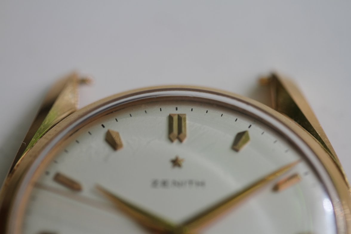
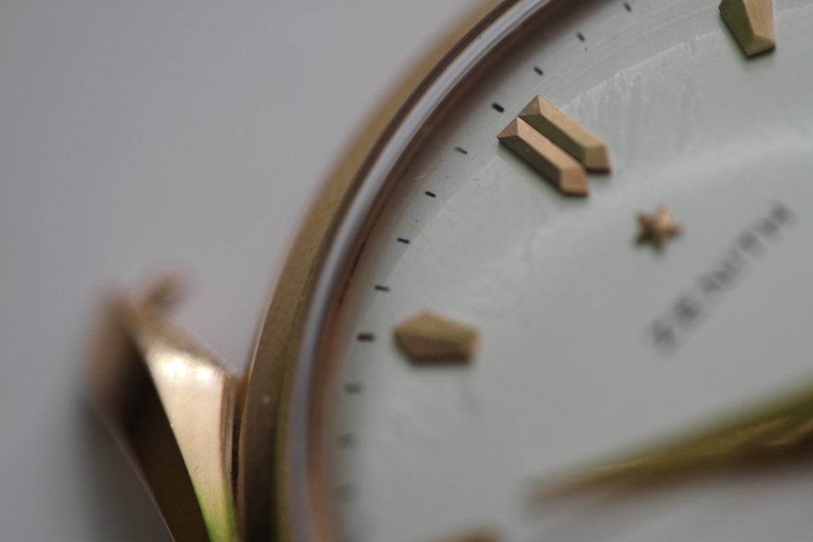
The condition of the dial matches well with its associated components. The overall condition is plausible given the condition of similar examples.

The printing quality is of a high level. However, I do not believe that it far outreaches an astute dial restorer. I acknowledge that this view is contentious. Here is the signature of a well done Longines redial beside an original.

ex.JPG

Though aspects such as the outer track appear untouched, the style of the primary text and the width of the secondary text do not compare well with similar examples. There is too much space in between the letters of the word “chronometre”. The letters of the word “Zenith” do not appear horizontally elongated as they do on other examples (note the E). The letters of the word “automatic” look slightly too close to each other and the typeface looks incorrect. Note the crosses of the T’s; they are too short. The span of “Swiss made” is too narrow. The W of "Swiss" and the D of "made" do not extend outside of the 29 and 31 markers. This is not the case on the similar examples that I have found.

Based on the limited number of comparisons that I have made with similar and allegedly original pieces, I believe that this dial has been reprinted.
Edited:
 
Posts
4,048
Likes
9,185
hi

I know I am late but here is my last 135 Zenith .... ( out of 3 watches and one loose movement ) this is the one I kept.


Good Hunting

bIll Sohne
 
Posts
6,713
Likes
18,550
regarding the originality of the dial finish: Dibs ipsa loquitur ;)
 
Posts
8,741
Likes
69,398
regarding the originality of the dial finish: Dibs ipsa loquitur ;)

Shouldn't it be dibsum ipsa loquitur?:p