Zenith El Primero overlapping subdials problem solved?

Posts
283
Likes
553
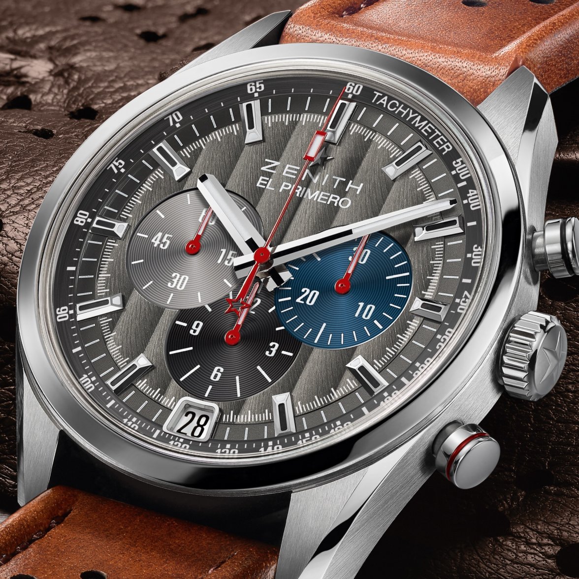
I just recently discovered the Zenith El Primero watches and just purchased a Striking 10th. I absolutely love the design of these watches - the tri-color subdials, the fit and finish of these watches is incredible. One of the reasons I purchased the Striking 10th was that supposed overlapping dial "design flaw" was mitigated (Link Here for a detailed explanation).

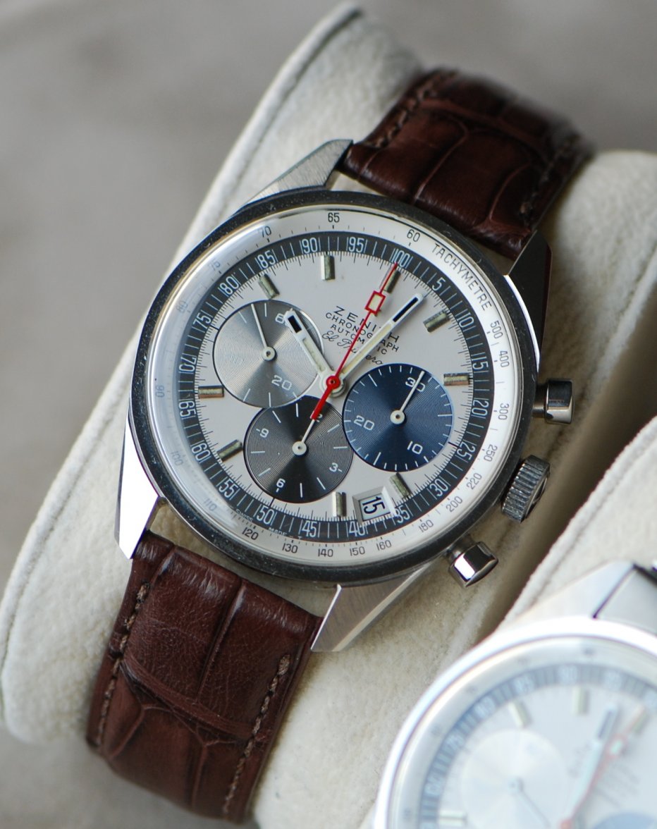
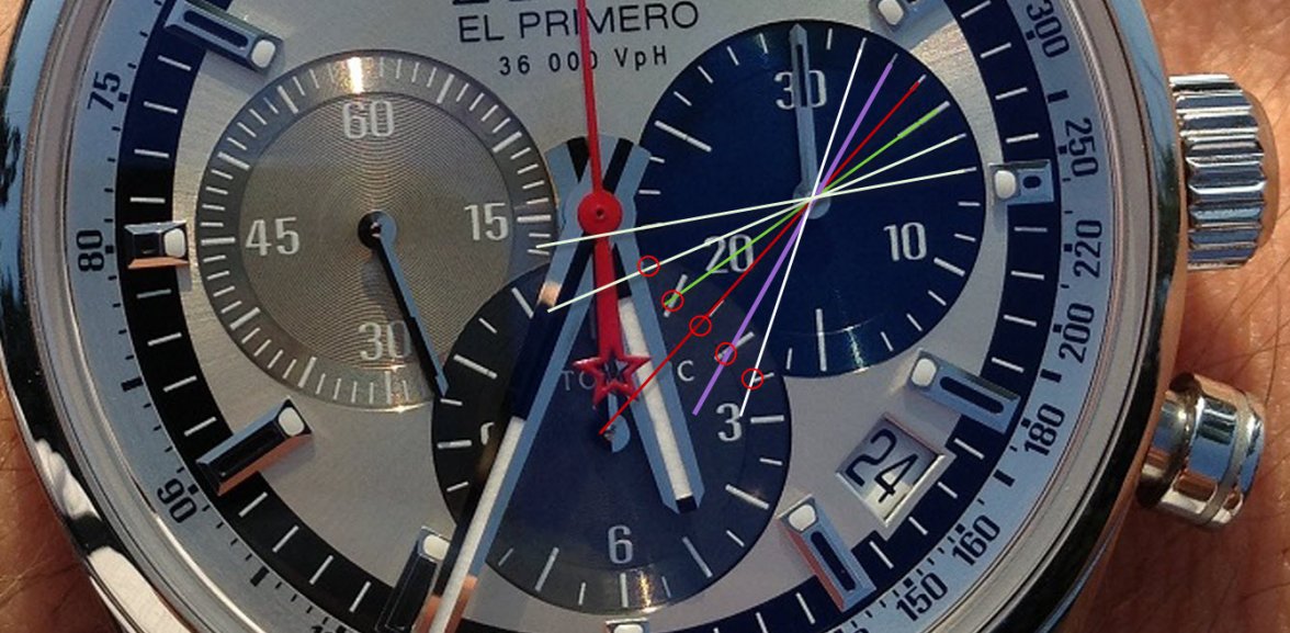
I really love the look of the 38mm 1969 watch but the "flawed" design of the minutes subdial stopped me. Then I read a review of the 38mm on Hodinkee (Link) and one of the comments made the following assertion: Sub-dials are perfect in design. In fact, here's what you do: Save the steel bracelet photo as your desktop background. Take a clear ruler to it and see that the 30 minute and 12 hour dials markers are lined up so that the 30 minute is perfectly readable! And if the second sub-dial at 9 is a bother, then remember: when doing chronograph functions, one uses the big red hand. Yes, this watch design is perfect in every way, right down to the unobtrusive and subtle date. A classic from 1969 that looks contemporary today.

I copied a picture of the 38mm from the internet and marked it up to see if the hour hash marks could substitute for the missing/overlapped minutes hash marks and the commenter was correct. The hour hash marks match the missing minutes marks to the point that the subdial is actually not really unreadable. Does this mitigate the supposed "design flaw" of the overlapping subdials? It would be great if someone with the 38mm or even the 42mm could take some pictures of the chronograph at the 17-21 minute values. Picture below. Comments?
El Prim 38-uncoded.jpg
Edited:
 
Posts
283
Likes
553
Was I totally off base on this thread? No comments... I guess I was wondering if the 38mm chrono minutes actually work as described above when at first glance it looks problematic. It would be great if true, I would put this watch back on my list. If true, I wonder why Zenith does not do a better job of explaining the design and how one would read the chrono minutes between the 17-21 values.
 
Posts
558
Likes
1,046
I don't know that you were totally off base. You were very analytical.

My opinion is that I love this dial and have never had any trouble reading it. I think it is one of the greatest dial layouts ever. I never understood what the problem was. I guess I am willing to say that the dial is a matter of taste. You like it or you don't. Buy it or don't.

This is like any other watch purchase. If you have doubts about how comfortable you will be with this look on your wrist you probably should be on the don't buy side.

JohnCote
 
Posts
283
Likes
553
I don't know that you were totally off base. You were very analytical.

My opinion is that I love this dial and have never had any trouble reading it. I think it is one of the greatest dial layouts ever. I never understood what the problem was. I guess I am willing to say that the dial is a matter of taste. You like it or you don't. Buy it or don't.

This is like any other watch purchase. If you have doubts about how comfortable you will be with this look on your wrist you probably should be on the don't buy side.

JohnCote

I really love the dial and design. What I was getting at, from the watch reviews at many "expert" sites I had read - said that the overlapping subs caused a readability problem. What I found in the comments thread was a little deeper - the commenter was saying that the design of the hours subdial was overt such that the hour hash lines are set/positioned to allow one to read the minutes even though overlapped. If true, that means I have gained even more respect and admiration for the design. For me the design is now - not just beautiful but deeper and more purposeful, complicated and brilliant. Even though the subdial for the minutes is overlapped and may look obscured - the design of the hours subdial allows one to easily read the value of the minutes. That means these "expert reviewers" did not understand fully the design as I did not either.

I guess I love the fact that Zenith created a beautiful design that has a level of sophistication not readily apparent at first viewing but that needs to be revealed. What looks like a design that trades beauty for a functionality flaw is actually not and the design accounts for it - making it both beautiful and functional on a deeper level.

I guess I wanted to know if that was true. Short of finding a local AD or someone who owns the 38mm and trying it out, I thought I would ask in a post, I guess that did not come across.
 
Posts
8,741
Likes
69,398
I'm a fan of this heritage reference, overlapping dials and all. Would like to add the 1969 original some time.

The original original... The A386, I like even more. But the currrent price for an example I could live with is no longer a match with my desire to own one.
 
Posts
558
Likes
1,046
I guess I love the fact that Zenith created a beautiful design that has a level of sophistication not readily apparent at first viewing but that needs to be revealed. What looks like a design that trades beauty for a functionality flaw is actually not and the design accounts for it - making it both beautiful and functional on a deeper level.

I guess I wanted to know if that was true. Short of finding a local AD or someone who owns the 38mm and trying it out, I thought I would ask in a post, I guess that did not come across.

I did not mean to short change your analysis. What you came up with makes sense to me but I think most people will simply instinctively read the dial that way. I find my self attracted to dials that are a little complicated and different. I have been a fan of the 386 for a long time and I think both modern tributes are well done.

JohnCote
 
Posts
28,720
Likes
34,938
This is my favourite feature of the original A386, the fact that they painted the second marks on the outside edge of the date window bevel so you can still read it to the second:

Screen Shot 2016-08-24 at 2.33.45 pm.jpg
 
Posts
283
Likes
553
This is my favourite feature of the original A386, the fact that they painted the second marks on the outside edge of the date window bevel so you can still read it to the second:

Screen Shot 2016-08-24 at 2.33.45 pm.jpg

Wow, that is so cool. I looked at the New Vintage 1969 and they do that on that watch also. I have to get one of those. The more I learn about Zenith the more I deeply appreciate this company.
 
Posts
28,720
Likes
34,938
The person who designed the A386 I always imagine being a bit like the guy who made the Mercedes 600 Pullman or Citroen SM, just every little detail thought out and engineered beyond the point where most people stop caring, you can look at its little elements and features all day long with a loupe from the movement itself to the dial hands and caseback and see how much effort went in.
 
Posts
389
Likes
1,021
Mine's the modern version with the 1/10th of second chrono.

The dial overlap doesn't bother me in the slightest - in fact it was one of the more appealing details of the design aesthetic.

However, the reading of the seconds subdial at 3o'clock doesn't line up quite like the version with minutes and hours and a tachymetre scale.

On the plus side, I get a 1/10th of second read-out.


I posted a short video of it screaming around the dial in the WRUW sections a few weeks back:-


There's something mesmerising about that centre chrono swirling around at high speed that gets you timing all sorts of things to a tenth of second, well, because...

I don;'t think it supports the argument of readability, but I don't care about that for the few seconds involved, its not that challenging to sort it out.
 
Posts
238
Likes
683
:thumbsup:
This is my favourite feature of the original A386, the fact that they painted the second marks on the outside edge of the date window bevel so you can still read it to the second:

Screen Shot 2016-08-24 at 2.33.45 pm.jpg
... and of A384, A385, A3817, A3818, etc.
 
Posts
283
Likes
553
Mine's the modern version with the 1/10th of second chrono.

The dial overlap doesn't bother me in the slightest - in fact it was one of the more appealing details of the design aesthetic.

However, the reading of the seconds subdial at 3o'clock doesn't line up quite like the version with minutes and hours and a tachymetre scale.

On the plus side, I get a 1/10th of second read-out.


I posted a short video of it screaming around the dial in the WRUW sections a few weeks back:-


There's something mesmerising about that centre chrono swirling around at high speed that gets you timing all sorts of things to a tenth of second, well, because...

I don;'t think it supports the argument of readability, but I don't care about that for the few seconds involved, its not that challenging to sort it out.


I have the 1/10th of a Second also. Fantastic watch, I am absolutely in love with the watch. In this design the center minutes subdial does obscure the right side dial which is really just a 10-second counter. You only need to be able to read that dial to a 10 second range since the single digit and 1/10th values are displayed by the red hand sweeping chrono. So the fact that the individual seconds are obscured does not matter, you just need to read it to the 30-40, 40-50 range which is no problem. From a pure functionality perspective the right hand dial should really only have hash marks for the 0,10, 20, 30, 40, and 50 second values. The individual marks are redundant with the chrono hand.
 
Posts
373
Likes
389
Wow, that is so cool. I looked at the New Vintage 1969 and they do that on that watch also.
No they don't, please show me.
 
Posts
283
Likes
553
Posts
373
Likes
389
Oh, my bad. I thought you were talking about this watch:

cc47069f3d55f4f4db9f6e3f5929d569.jpg


Sorry
 
Posts
283
Likes
553
Oh, my bad. I thought you were talking about this watch:
Sorry
No problem, I think both those watches have "1969" in the name. The 1969 above in your post was what I was originally posting about. My new grail watch is the limited edition (500 run) El Primero New Vintage 1969 watch, which I was referring to and is probably not easy to find.
 
Posts
1,626
Likes
6,218
Sub-dials are perfect in design. In fact, here's what you do: Save the steel bracelet photo as your desktop background. Take a clear ruler to it and see that the 30 minute and 12 hour dials markers are lined up so that the 30 minute is perfectly readable!
Sorry but I disagree. I think that is a coincidence and not a design choice and this person is just trying to justify the "mistake". Actually a better word would be compromise: Zenith had to make a choice to balance aesthetic and functionality and this what they landed on, it's a coincidence that the hour markers fall close to where the missing ones would be. Functionally it would have made more sense to cut the hour subdial (like the original does), because less granularity is needed, but maybe with the different proportions it didn't look right so they did this instead.
 
Posts
283
Likes
553
Sorry but I disagree. I think that is a coincidence and not a design choice and this person is just trying to justify the "mistake". Actually a better word would be compromise: Zenith had to make a choice to balance aesthetic and functionality and this what they landed on, it's a coincidence that the hour markers fall close to where the missing ones would be. Functionally it would have made more sense to cut the hour subdial (like the original does), because less granularity is needed, but maybe with the different proportions it didn't look right so they did this instead.

They actually flipped it on the new classic cars putting the minutes sub over the hours. It looks really good also...

image.jpeg
 
Posts
6,713
Likes
18,550
They actually flipped it on the new classic cars putting the minutes sub over the hours. It looks really good also...

image.jpeg

What an amazingly original idea
cDSC_0170.jpg